AI Render Brand Style Guide: How to Match in 2026
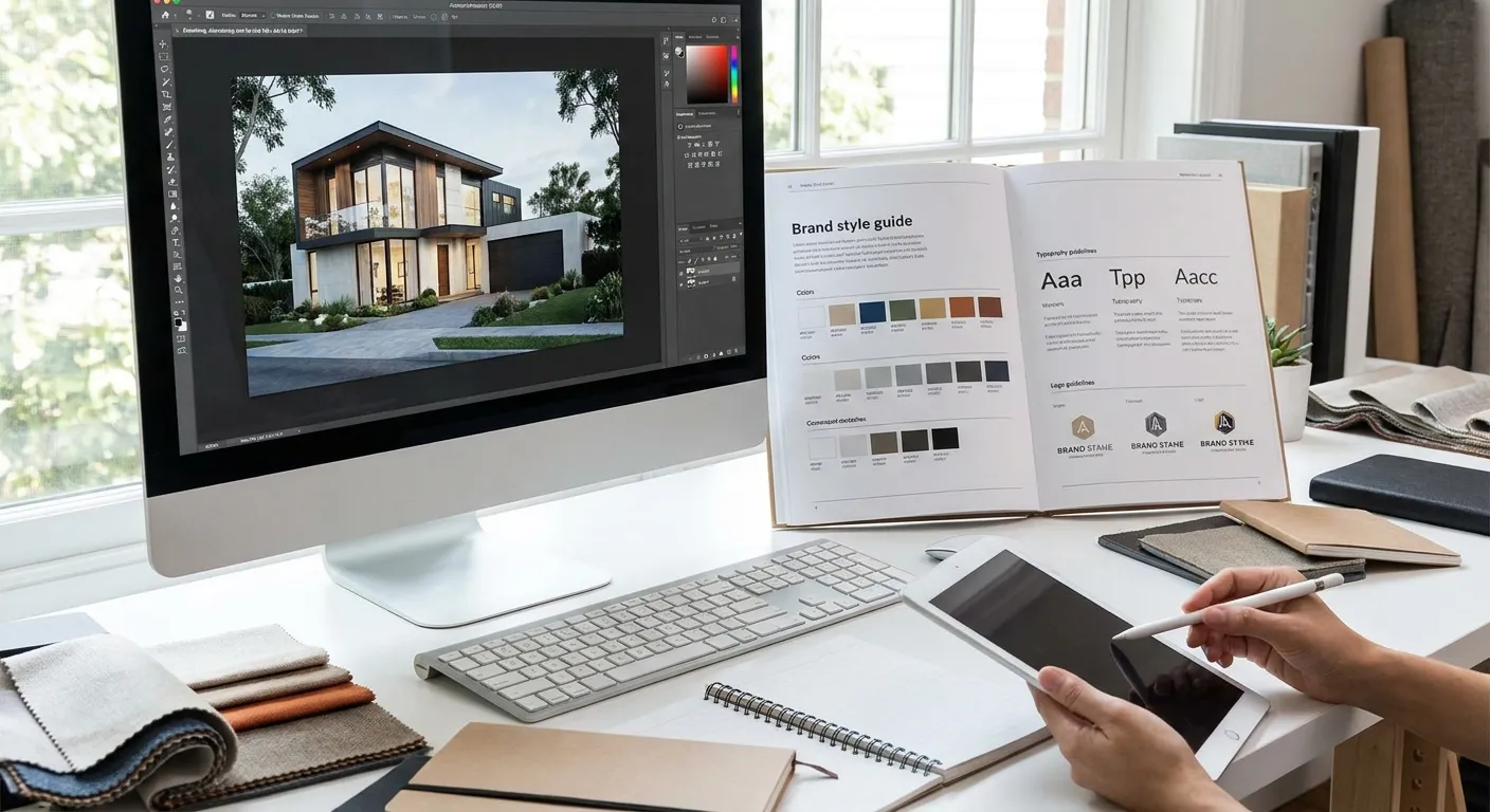
Commercial clients hire architects and interior designers who can produce renders that look like the brand made them, not like a generic AI output. Matching AI renders to a brand style guide takes a repeatable process, not luck with the prompt box.
- Lock a prompt template with brand color hex codes, materials, and lighting mood before generating anything — buy in on this step.
- An ai render brand style guide needs 4 fixed variables: palette, material finish, lighting temperature, camera angle.
- Run every render against the style guide's swatch and photography reference before sending to the client — Verdict: mandatory, not optional.
- Export in the client's approved file format and naming convention or the deliverable gets rejected regardless of render quality.
Why this matters
A commercial client's brand style guide covers color values, material finishes, lighting mood, and camera framing for a reason: every touchpoint that reaches their customers has to look like the same company made it. A render that nails the geometry but drifts on color temperature or material sheen reads as off-brand even when the architecture is correct.
In 2026, more design agencies pitch renders as part of a brand deliverable, not a standalone image. That means the render has to match material and finish variations the client already approved somewhere else in their guide, whether that's a lobby finish schedule or a retail fixture spec sheet. Miss that and the whole deliverable gets kicked back for revision, which costs the studio time and the client confidence.
What you'll need
- A copy of the client's brand style guide (PDF, deck, or Figma link) with color hex codes, approved material references, and photography examples
- A finished 3D model or screenshot from SketchUp, Revit, Rhino, Blender, or ArchiCAD
- A locked prompt template you can reuse across every render in the set
- A reference photo or render the client has already approved, if one exists
- 15-30 minutes per render for generation, review, and a revision pass
The steps
1. Extract the brand's core visual rules from the style guide
Pull four things out of the style guide before you touch a prompt: primary and secondary colors as hex codes, named material finishes (brushed brass, matte oak, honed stone), the lighting mood (warm and residential vs. cool and clinical), and the camera style (eye-level, wide-angle, drone). Write these down as a one-page cheat sheet.
Most brand guides bury this information across 40+ pages of logo lockups and typography rules. Skipping the extraction step means re-reading the whole document every time a client asks for a revision, which burns hours you don't have on a commercial timeline.
Common mistake: treating the brand guide's example photography as decoration instead of a lighting reference. Those photos are the client's actual visual target.
2. Build a locked prompt template with brand-specific descriptors
Write one prompt template per project that hardcodes the brand's hex codes, named materials, and lighting mood, then swap only the room or angle description between renders. A locked template might read: "photorealistic interior render, warm afternoon light at 3200K, brushed brass fixtures, matte oak flooring, walls in #E8DFD3, eye-level camera."
This matters because AI rendering tools interpret vague prompts inconsistently render to render. "Modern and warm" produces a different result every time; "#E8DFD3 walls, 3200K lighting" produces the same result reliably.
Common mistake: rewriting the prompt from scratch for each room. Reuse the template and change only the variable that needs to change.
3. Match materials, finishes, and color palette to brand specs
Generate a test render and compare it against the client's approved swatches side by side, not from memory. Color drift is the single most common reason a commercial client rejects a render — a wall that reads as warm beige in the guide but renders as tan or gray fails the brand check even if everything else is correct.
If materials drift, name the finish explicitly in the prompt rather than describing it generically. "Honed Carrara marble" produces a tighter match than "marble countertop."
4. Set lighting and mood to match brand photography direction
Lighting temperature and time of day carry more brand identity than most teams expect. A hospitality brand that photographs everything at golden hour will reject a render lit like a flat noon office scene, even with correct materials.
Specify color temperature in Kelvin and time of day in every prompt: "5600K daylight, midday" for a clinical retail look, "3000K warm, dusk" for hospitality. Reference realistic lighting to AI architectural renders if the lighting keeps reading flat across a set.
5. Standardize camera angles and composition across renders
Commercial clients present render sets side by side in decks and proposals, so inconsistent framing across images looks unprofessional even when each individual render is strong. Pick one primary angle (commonly eye-level at 1.6m) and one wide establishing angle, then apply both across every space in the set.
Common mistake: letting camera height and lens angle vary between rooms in the same deliverable. A brand-consistent set looks like it was shot by one photographer, not five.
“If a render needs three rounds of revisions to match brand color, the prompt template is broken, not the model.”
6. Run a consistency check against the brand style guide
Before sending anything to the client, lay the render next to the style guide's color swatches, material board, and photography reference on one screen. Check color match, material finish, lighting temperature, and camera framing against the four variables from Step 1.
Matching a render to a style guide is one instance of a larger discipline: agencies apply brand strategy for consistency across web design, sales decks, and now renders, because a broken visual language costs credibility long before it costs a sale. Treat the render check the same way a brand team treats a logo placement check — a fixed rule, not a judgment call.
7. Export renders in brand-approved formats and file naming
Commercial clients often specify file format, resolution, and naming convention in the same style guide that covers color and materials. A render that's perfect visually but delivered as a low-res JPEG when the guide calls for print-ready TIFFs still gets rejected.
Check the deliverable spec before the final export pass. If the render is heading into a proposal or presentation board, follow the steps in export renders for print-quality presentation boards so resolution and color profile survive the print process.
Generate on-brand renders faster
Upload a screenshot, lock the brand descriptors, generate in seconds.
Troubleshooting
- Colors look close but not exact: Specify the hex code directly in the prompt instead of a color name. "Warm beige" is interpreted loosely; "#D9C7AE" is not.
- Client flags wrong material sheen: Name the finish precisely ("satin brass" vs. "polished brass") — sheen is a bigger visual signal than most teams expect.
- Lighting looks inconsistent across a set of 5+ renders: Fix the Kelvin value and time of day in the locked template so every render in the batch pulls from the same lighting instruction.
- Brand logo or wordmark distorts inside the render: Keep the logo out of the AI generation step entirely and overlay it in post-production instead.
- Style drifts between revision rounds: Reuse the exact prompt template from the first approved render rather than writing a new prompt for the revision.
- Client rejects the whole set over one off-brand image: Fix and resend the single render — don't regenerate the full set from scratch, which reintroduces drift on the images that already passed.
Tools and resources
- The client's brand style guide, kept open alongside your prompt tool during generation
- A locked prompt template document, versioned per project
- AI rendering software for design agencies if the studio is scaling this process across multiple commercial accounts
- A shared folder for approved reference renders so future team members match the same brand rules
What to do next
Once the render matches the brand style guide, the next friction point is usually the client conversation, not the image itself. Walk through present renovation concepts to clients with AI renders to frame the render set in a way that survives the first round of stakeholder feedback.
FAQ
What is an ai render brand style guide?
An ai render brand style guide is a fixed set of prompt rules — color hex codes, material finishes, lighting temperature, and camera angle — pulled from a client's brand guide and reused across every render in a project. It keeps a render set looking like one studio produced it in 2026, not five different sessions.
How do you keep AI renders consistent across a large project?
Lock one prompt template per project and change only the room description between renders, not the color, material, or lighting instructions. Consistency comes from reusing the same fixed variables, not from generating each render independently.
Can AI renders match an exact brand color palette?
Yes, when the prompt specifies the exact hex code rather than a color name. Loose descriptors like "warm beige" produce different results each generation; a hex code like #D9C7AE produces a tighter, repeatable match.
Why do commercial clients reject renders that look technically correct?
Most rejections come from lighting temperature or material sheen drifting off the brand's photography reference, not from the architecture itself. Commercial clients check renders against their existing brand photography, so a flat or mismatched mood fails the review even with correct geometry.
Is it better to match brand style before or after generating the render?
Before. Building the color, material, and lighting rules into the prompt template up front avoids repeated revision rounds. Fixing brand mismatches after generation costs more time than locking the template correctly at the start.
How many renders should share one prompt template?
Every render in the same deliverable set should share one locked template, with only the room or camera angle description changing between images. This is what keeps a 10-render commercial package looking cohesive.
Does brand style guide matching apply to exterior renders too?
Yes — exterior renders follow the same four variables: facade material finish, brand color accents, lighting mood, and standardized camera height, matched against the same style guide used for interiors.
One last thing
The fastest way to catch a brand mismatch before the client does: put the render next to the style guide's photography reference at 50% zoom, not full screen. Color and lighting drift that's invisible up close becomes obvious the moment the image is small enough to read like a thumbnail in a deck, which is exactly how most commercial clients will first see it.